Thursday 7 June 2012

Statistics and Probability 4

In this post, I shall be talking about Scatter Graphs and Stem and Leaf Diagrams. These are again two types of Statistical Charts / Diagrams.

SCATTERGRAPH

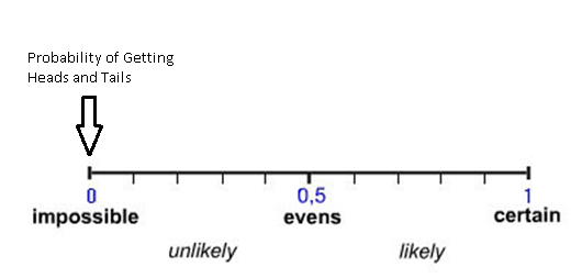
A Scattegraph / Scatter plot, is a graph used to describe the relationship between two variables. There are 3 relationships we need to know about, which we can find through Scatter Graphs, known as Correlations.

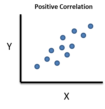
1) Positive Correlation
                                                                                                                                                                                                              
The first relationship we need to know about is a postitive correlation. This is where an increase in Variable X results in an increase in Variable Y.  (or vice versa).This is shown diagramatically when the points are more or less, trending diagonally upwards. (not counting for anamolous)

Examples include:
 - Higher the number of cigarrettes smoked, the higher the chance of lung cancer
- Higher the number of hours spent studying, the higher the chance of getting a better grade.

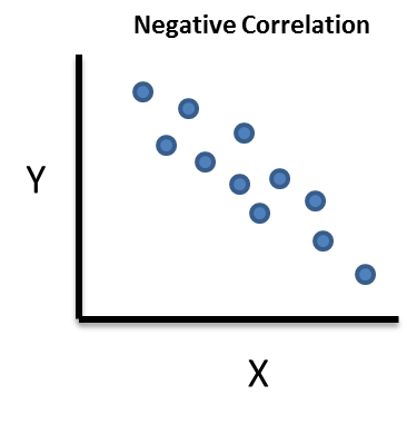
2) Negative Correlation


The second relationship we need to know about is a negative correlation. This is where an decrease in Variable X, results in an increase in Variable Y. This is shown diagramatically, when the points are downward sloping (in a diagonal way), again not counting for anamolous results.


Examples include:
- The colder it is outside, the higher your heating bill
- The more traffic there is, the higher the time required to get somewhere.
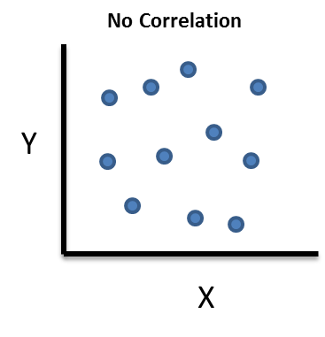

negative correlation


3) No Correlation


The third and final relationship, is where there is no correlation. In this case, Variable X has no affect on Variable Y. This diagramtically, means the points do not show any general trend, and generally scattered all over the place.

Examples include :
- The amount of food you eat, does not affect your salary.


Example 1)

 The scatter graph above shows the relationship between The Life Expectancy of a human in years, and the Birth Rate, in countries.

a) Describe what correlation is shown
b)Draw a line of best fit
c) Estimate What the life expectancy will be at a birth rate of 35 ?

a) As we can see the higher the birth rate, the lower the life expectancy, this means the graph has negative correlation.

b) A line of best fit, is a straight line to be drawn with a ruler, which more or less covers all the points on the graph (which goes through them, so that points are equally distributed and either side of the line):


There could be different lines of best fit, as long as it fits the criteria above.


c) To estimate the life expectancy, at a birth rate of 35. We go to 35 on the x-axis, (birth rate), go up to the line of best fit, and read of the life expectancy. This is approximately 61 years.


STEM AND LEAF DIAGRAMS

 A Steam and Leaf Diagram, is another way of represeting Quantitative Data. It is organised by having two parts, which are divided by a vertical line. On the left hand side of the line, is called the Stem, and on the right hand side is called the Leaf.

 A Stem and Leaf can be used to organise a list of numbers.


Example :


Draw a stem and Leaf diagram to show the following numbers :
24, 13 , 23 , 30 , 1 ,12 , 15 , 37, 23 , 2, 28 , 36


1) Sort the numbers in ascending order :


1, 2 , 12 , 13 ,15 , 23 , 24 , 28 , 30 , 36 , 37


2) We need to be see what goes in stem part, and leaf part.
The steam represents the first digit of the numbers (for 2 digit numbers), meaning the tens. We can see the stems will be 0 , 1 , 2 , 3


3) Our Leaves correspond to the second digit of the numbers. Here the leaf represents ones.


As you can see the from the key, 1 | 2 means 12, so each number is ordered in that way. Note 1 , 2 has no tens, thus the 0 in the stem.

  • If the number are decimals, the same thing applies, the number before the decimal is the stem, and the number after is the leaf.
  • If the number is in hundreds ( 3 digits), the first 2 digits are the stem. the last digit is the leaf
  • If the same number is in the list more than once, than simply include it on your stem and leaf however much time it occurs

Exercise 2

 Draw a stem and leaf diagram for the following numbers :
290, 302, 284, 291, 271, 291, 283


Tuesday 5 June 2012

Statistics and Probability 3

In this post, I shall be cover Pictograms and Pie Charts.

PICTOGRAMS

A Pictogram, is another way of representing data. Here pictures of something are used in the form of counting tally. For Example, if the pictogram shows something about amount of sunshine each day per week, then a sun maybe used to represent say 4 hours of sunshine, in this case half a sun would be 2 hours of sunshine, a 1/4 of the sun would mean 1 hour of sunshine.

Example

Here is a pictogram of the average hours of sunshine, say per week, during winter. Let's say one sun represents 2 hours of sunshine, (this would be written as a key or legend on the actual pictogram).

How many hours of sunshines does each town recieve ?

Fineborough = 2 hours
Gammaby =  6 hours
Betatown = 10 hours
Alphaville = 6 hours + (1/2 a sun = 1 hour)
= 7 hours

Two more towns - London and Delhi recieve 9 hours and 20 hours of sun per week. Show this on the pictogram.


As you can see Delhi has 20 hours, that would equate to 10 suns. London has 9 hours, that would equate to 4 suns and half a sun !

Exercise 1


This pictogram above shows how many chocolate bars were sold, during a school week. 1 grid represents 8 chocolate bars sold.
1) How many Chocolate Bars were sold on each Days of the week ?

2) During a saturday school fair, the school managed to sell a 37 chocolates, how many grids would this be ?


 PIECHARTS

Piechart is another way of representing data, where each category is presented as a proportion out of the total.
We have to think of the whole piechart (whole circle) as 360 degrees. Each proportion of each category is worked out by dividing the total frequency by 360,and then multiplying each frequency by (360 divided by total frequency).This gives you the angle size of the category, draw it up using a ruler and do that for each category, remember the total angles should add up to 360 degrees.

Example

A Survey asked what methods to pupils use to get to school. Here are the results

1st step is we find the total frequency (sum) which is 90.
Then we have to find how much each angle will be for each category to do this we :

We divide 360/90 which is 4. We now have to multiply each frequency by 4 to give the angle size.
Walk = 17*4
=68 degrees
Cycle = 19*4
=76 degrees
Bus = 43*4
=172 degrees
Car = 11*4
=44 degrees

Now use a protractor to carefully draw out each catgeory as a sector of the circle :


We can see each category's percentage as a whole :

Walk = (17 / 90) *100
=19% (rounded up from 18.8)

Cycle = 21% (rounded down from 21.1)

Bus = 48% (rounded up from 47.7)
Car = 12% (rounded down from 12.2)

Exercise 2

Sarah carries out a survey from pupils. She asks them their favourite crisps flavour. Here are the results :

Favourite Crisps                 Frequency                           Angle
Plain                                             13                                             
Roast Beef                                  20                    
Chicken                                       10
Cheese & Onion                         17 

Complete the Table, and draw an accurate pie graph.


Monday 4 June 2012

Statistics and Probability 2

In this post, I shall write about about some of things which are really basic, stuff you most probably done in KS3. This actually, should have been my first post, nevertheless I will be writing about
  • The Probability Scale
  • The Averages 
THE PROBABILITY SCALE

Firstly, Probability of an event is a measure of how likely an event is likely to happen. The probability of a fair event, can be found using the formula :

For Some Event E :

P(E) = Number of ways the event E can occur / The number of possible outcomes


The probability of events, can be shown using a probability scale :

The Probability Scale
This is an example of the probability scale, it is basically in simple terms a number line from 0 to 1. Probability can only be between 0 and 1. If it is 0, that means that event can never happen (impossible), if it is 1, that means it will always happen (certain). If it is 1/2, there is even chance of it happening. This is best demonstrated using an example :

Example :

Susan flips a fair coin. On the probability scale, mark the probability that :

a) The outcome will be heads
b) The outcome will be tails
c) The outcome will be heads or tails
d) The outcome will heads and tails

A fair coin has 2 sides (number of possible outcomes = 2), one is heads, one is tails, so each outcome (heads or tails), only appears once. Using the formula :

P(Heads) = 1 / 2 
P(Tails) = 1/2

There is no other outcome other than heads or tails, so the probability of getting heads or tails is :
P(Heads or Tails) = 1

The coin can only land on either heads or tails, not on both so:
P(Heads and Tails) = 0


a)

b)


c)


d)


Example 2 (Exam Style)

There are 4 numbered cars in a bag. They are numbered 1,3,5 and 7. A card is drawn at random. On the Probability Scale, mark with a letter, the probability:

i) 3 will be drawn (mark with letter A)
ii) an even number will be drawn (mark with letter B)
iii) a number greater than 2 will be drawn (mark with letter C)
iv) a number less than 8 will be drawn (mark with letter D)

i) Work out the probability using the formula :

3 occurs once in the bag (number of ways an event can occur), there are 4 possible outcomes.
so P(3) = 1/4 or 0.25

ii) An Even number, is a multiple of 2, there are no even numbers in the bag, so 
P(Even Number) = 0

iii) A number greater than 2. The numbers greater than 2 are 3,5 and 7. So the number of ways an event occur is 3, and total possible outcomes is 4.
P(Greater than 2) = 3 /4 or 0.75

iv) A number less than 8. All the numbers are less than 8, so total number of outcomes is 4, number ways an event can occur is 4, so 
P(Less than 8) = 1


Anything less than 1/2 (0.5) is unlikely to happen, anything more is likely to happen. The scale in this case goes up in 0.1's, the one in the exam might just show 0, 0.5 and 1. With no lines, you would have to roughly mark any other probabilities asked for.

Exercise Question 1)

There are 4 sweets in a bag. 
There are 2 toffees, a mint and a jelly baby.
A sweet is taken at random

On the probability scale, mark with a letter, the probability that :

i) a mint will be taken (use letter A)
ii) a toffee will be taken (use letter B)
iii) a sherbet lemon will be taken (use letter C)


THE AVERAGES

The Averages of Data, can be used to gather many different conclusions about the data, they are known to be measures of Central Tendency, which is a term used in Statistics.

The Averages are :
  • Mean
  • Median
  • Mode
  • Range
The Mean, is basically the sum of all the numbers in the dataset / collection divided by the size of the dataset (how many values there are).

The Median is basically the middle value, that seperates the higher half from the lower half.

The Mode, is the most occuring / frequent value in the dataset.

The Range is the highest value in the highest value in the dataset minus the smallest value in the dataset.

Example:

2,10,4,1,3,3,1,3,9

The Mean = sum of all numbers / size of dataset (how many values there are)

=(2 + 10 + 4 + 1 + 3 + 3 + 1 + 3 + 9) / 9
=36/9
= 4 is the mean

The Mode, is the most occuring number, 
= 3 is the mode

The Median is the middle number, first put the numbers in ascending order :

1,1,2,3,3,3,4,9,10

Then count how many numbers they are : 9
 Divide that by 2 : 4.5
The median will be the 4.5th item ?
To find this we get the 4th item (3) and 5th item(3), add them up (6) and divide by 2 which is 3.
= 3 is the median

Range is the biggest number - smallest number, so :
= 10 -1 
= 9 is the Range

Tricky Median Questions :

a) Find the median of the list:
2,5,6,8,8,9


The item which is the median is in =
( n + 1 ) / 2
n= number of values in dataset
here:


item which median is in = (6 + 1) / 2
= 3.5th item


So whenever we have a decimal as such, we take the 3rd item (6) and 4th item (8), take the sum which is 14. Divide that by 2, which is 7.


So the median is 7.


Exercise Question 2)

Sara measured the temperature at midnight for 12 nights during March. Here are the results :

-3 , -1 , 4 , 6 , 2 , -5 , 6 , 8 , 2 , 0 , 3 , 2

Find :
a) The mean temperature
b) The median temperature
c) The range of temperatures
d) The mode of temperatures

Averages from a Table

Sometimes a list won't be given. A Frequency Table will be given as a data form, to work out the averages from here, read the following example :

Example


a) Find the mean score
b) Find the median score
c) The modal score

We can simply make the list of data out of this table, like so, we start with the lowest value 

0,0,1,2,2,2,2,4,5,5

Note 0 appears 2 times, 1 appears once, 2 appears 4 times, 3 occurs 0 times, 4 occurs once and 5 occurs twice. (From the table)

a) The Mean = ( 0 + 0 + 1 + 2 + 2 + 2 + 2 + 4 + 5 + 5) / 6
= 23 /10
= Mean is 2.3

b) The Median, the list is already ordered, so firstly workout which item the median is in :
median = (10 + 1) / 2 
= 11/2 item
=5.5th item
 = Take the 5rd item (2) and 6th item (2)
= Add them up (4)
= Divide by 2 (2)
=Median is 2.

c) The modal score, the most occuring score is 2

Exercise Question 3 


Find the 
i) Mean
ii) Median
iii) Mode   

Friday 25 May 2012

Statistics and Probability 1

This post will cover the first of the posts for Statistics and Probability section for GCSE. It should cover the following objectives :


•Design and use two-way tables
for discrete and grouped data
• Design and use two-way tables for discrete
and grouped data
• Use information provided to complete a twoway
table


• Consider fairness
• Understand sample and population
• Design a question for a questionnaire
• Criticise questions for a questionnaire
• Use stratified sampling


STATISTICS
 
BASIC CONCEPTS


POPULATION
The entire population of objects being statistically investigated is called a population.
*Examples include the entire set of voters in an election (this population is well defined and finite). An entire batch of components produced at a factory (this population is hypothetical and infinite).


SAMPLE
A sample is a proportion, usually a relatively small proportion of a population.

WHY DO WE NEED DATA ?
Statistics is concerned with the properties of the whole population rather than with those of individual objects. Sometimes the entire population is surveyed to determine the characteristics of interest ( as in the population census carried out every ten years), but usually it is only practical to infer population characteristics from information provided by a sample.

QUESTIONAIRES AND DATA COLLECTION
 A Questionnaire is a type of data collection method. Usually there's a question, and a couple of boxes for choices. We need to know what makes a good questionnaire and a bad one.
Example :
Susan wants to collect information about the amount of sleep, pupils in her class get.  She designs a questionnaire for this :
 (Pretend bullet points are boxes!!)
How much sleep do you get ?
  • A lot         
  • Not Much
There are two things wrong with this questionnaire :
* It's totally rubbish. Why ?
1) The question dosen't refer to how much sleep per .... ? A time frame should be given.. How much sleep per night ? How much sleep per week ? How much sleep per year....
2) The answers are too ambigious. " A lot of sleep" can be different for different types of people. For me a lot of sleep >10 hours, for some that might mean 14 hours. So secondly, the choices should include some numerical choices.
An Improved Questionnaire for the same question would be something like this :
How many hours do you sleep per night  ?
  • 5 hours or less
  • More than 5 hours but less than or equal to 7
  • More than 7 but less than or equal to 8
  • More than 8 hours but less than or equal to 9
  • More than 9 hours
Though this is much better..
Exercise Question 1) Pick out a flaw from this Questionaire  

DATA COLLECTION
Tim Wants to Find Out which Soap Opera is the most popular with the pupils in his class. Design a suitable data collection sheet he could use.
Soap                                   Tally                                       Frequency
Coronation St.                    | | |                                             3
Hollyoaks                           | |                                               2
Eastenders                          | | | |                                           4
Emmerdale                         |                                                 1
Neigbours                          | | |                                              3
*I assume you know how to use tally. We strike through 4 tally marks, for the 5th tally.. and then continue a new tally of 4.
*Frequency is just the number of tally 

TWO WAY TABLES
 Two Way Tables are another way of representing data, where they are two variables, and some choices for those variables. In a Two Way Table, the far right handside column will be TOTALS, as will be the bottom most row.


The far right, and bottom box/cell contains the Total for all the columns and the Total for all the rows.


a = 10, b = 9, c= 15, d = 24 and e = 28. To Check Working Out Look Below


This example above is a Two-Way Table, where the totals' at the bottom are the total of all the boxes above them, and the totals' on the right hand side, are the total of all the boxes to the left of them


Q) Work out the Missing Variables a,b,c,d and e.


Well 13 + a + b = 32


So there's two unknown's so it's hard to work out.


b + 19 = 28, so b = 9


13 + a + 9 = 32


so a = 10


10 + d = 34, so d = 24


c + 24 + 19 =58


so c = 15


13 + 15 = e


e = 28


 DESIGNING A GOOD QUESTIONNAIRE


Tony wants to open a new restaurent. He wants to know what type of food people like. Design a suitable questionnaire he could use to find out what type of food people like ?


A good answer is made up of an unbiased question (not too much emphasis on one side of the coin, and not leading the person answering to make a preferred answer)... and good choices for the answers ( a range).

Example :
What type of food do you like eating?
  • Indian
  • Chinese
  • Italian
  • Other


Example Question 1 ) Mr Nicholson wants to find out what pupils think of his lessons. His questionnaire is as follows :

What do you think of my lessons?
  • Excellent
  • Very Good
  • Good
a) What is wrong with the question ?


*There is no choice for negative answers (bad, very bad)


Exercise Question 1)

How much time do you spend on Homework ?
  • A lot
  • Not much


a) What is wrong with the questionnaire ?


b) Design a better questionnaire


Exericse Question 2)


Sarah wants to find out what pupils think of the School Canteen. She plans to stand outside the Canteen at 12.30pm, and ask the Year 7 pupils to fill a questionnaire.


a) Why is this biased ?
b) Describe a way to make it less biased ?


STRATIFIED SAMPLING


Stratified Sampling is a type of sampling method from a population. When the number of people in certain sub groups of the population vary, a stratified sample may be used.


First the Sample is of 100 students, notice how there are different people in most of the different groups (boys different to girls, yr 7 different to yr 9, etc.)

First we get the sample percentage, we find this out  by the formula :
Sample Size / Population Size.

In this case the Sample Size is 100, the Population Size is the total of all the people so (70 +30 + 100 + 100 + 300 + 400 = 1000)

100/1000 = 0.1

Now we multiply this decimal by the number of people in each category (stratum size), to find out how many people of the category will be included in the sample :

Yr 7 Boys = 70 * 0.1 = 7
Yr 7 Girls = 30 * 0.1 = 3
Yr 8 Boys = 100 * 0.1 = 10
Yr 8 Girls = 100 * 0.1 = 10
Yr 9 Boys = 300 * 0.1 = 30
Yr 9 Girls = 400 * 0.1 = 40

 Exercise Question 3)